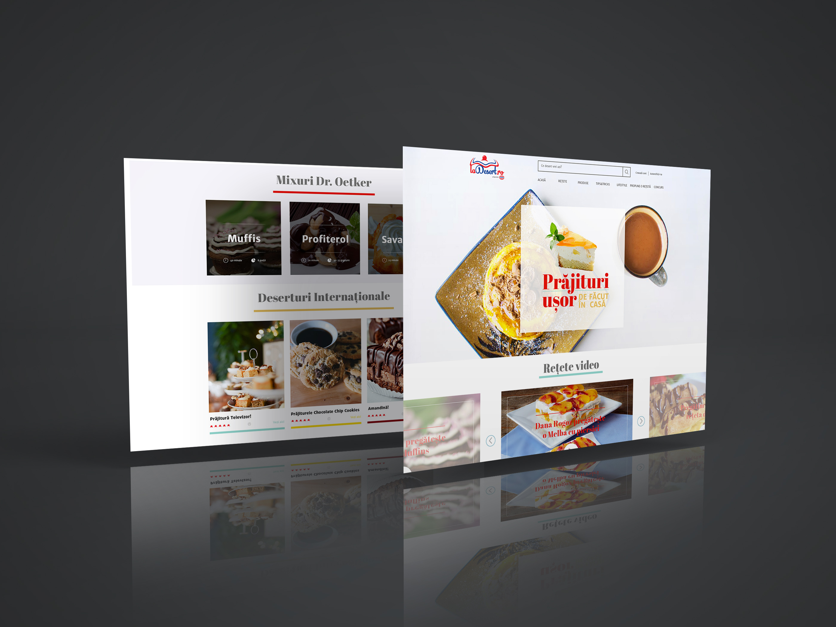
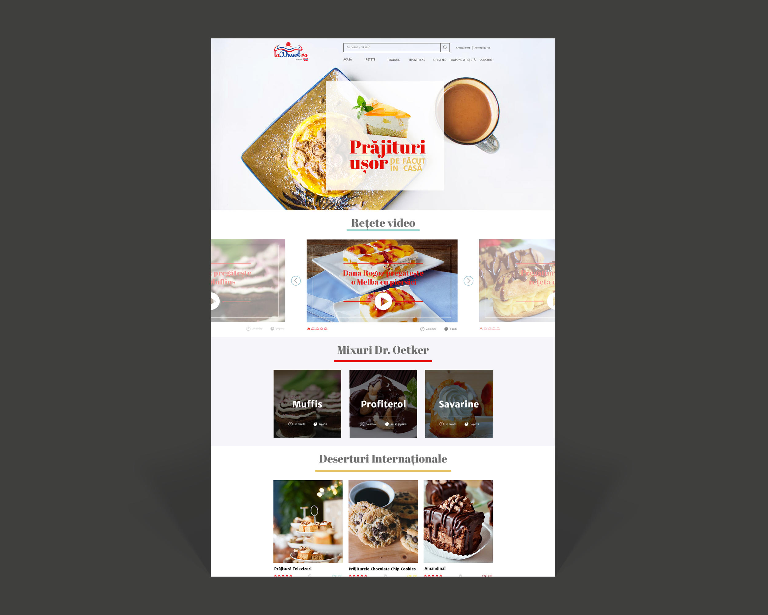
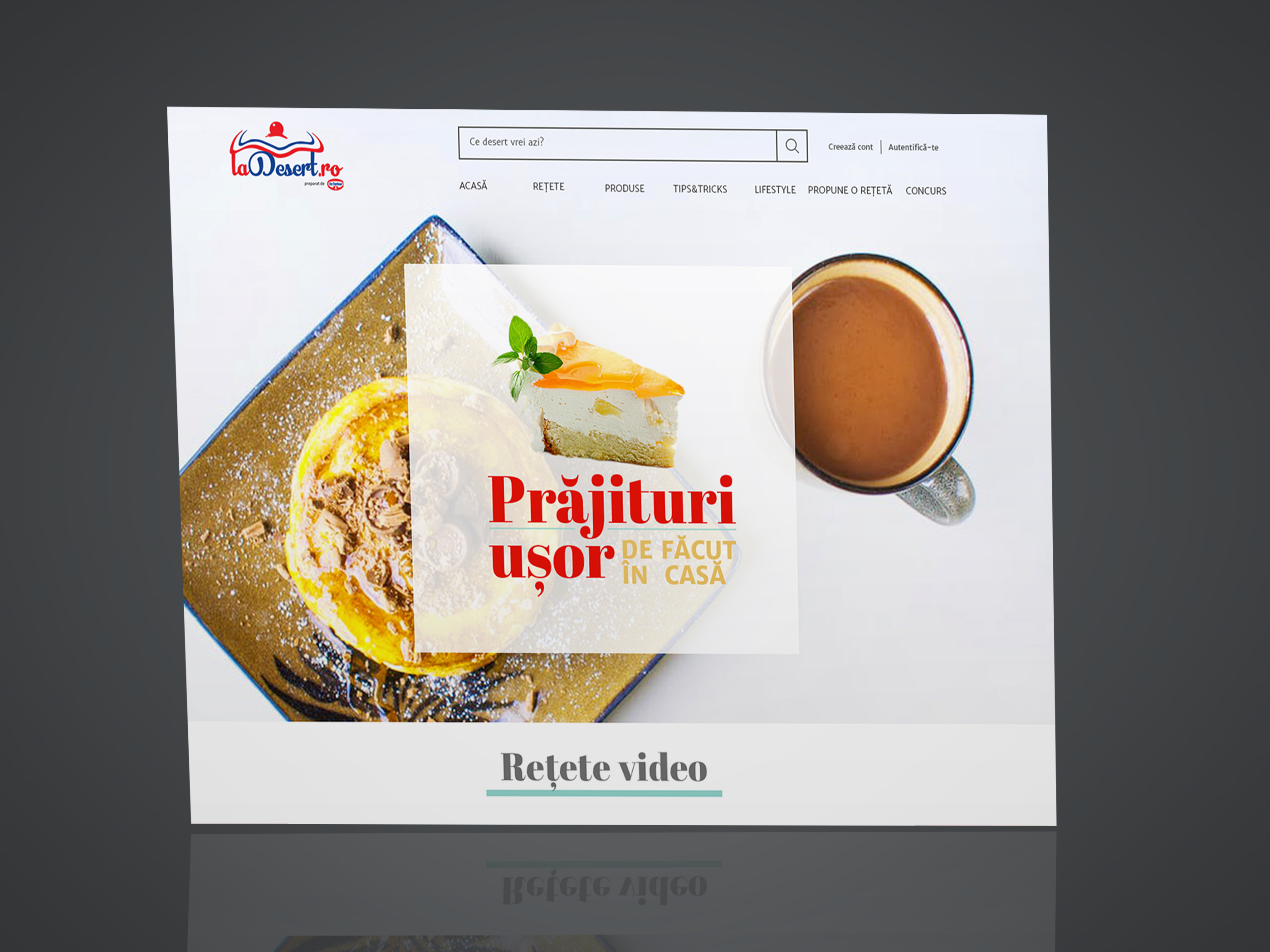
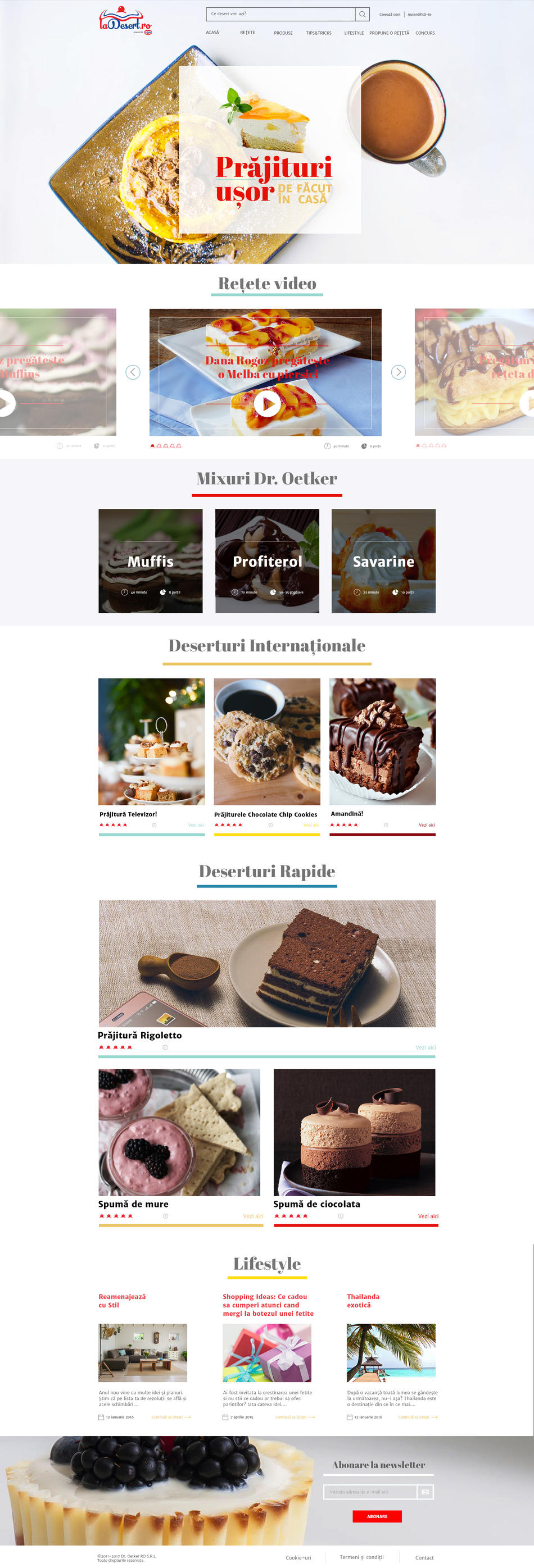
Playful and airy design for the layout structure
Warm colors and pictures to complement the logo and to make one think about food
Sticky menu at scroll, so the user has acces to links, search and login areas
Simple call to action buttons for each recipe
Rating icons were inspired by the logo cherry icon, for a better integration
Use of 2 clean google fonts, to emphasize the colorful elements